zondag 2 november 2014

A cryptic tale. Read closely...it does make sense!

Wow! it's been ages since I posted anything on here. I guess I've been busy with other things. Rummaging through the papers in my very disorganized desk the other day, I came across this short piece of writing I did back in 2010 and thought it might be fun to put it on here.

Ideally the two pieces of text should be placed oppositie one another for easy comparison, but for reasons of limited space I'll place the story first and it's "translation" underneath. Sorry for the need to scroll! Compare the "bold" words in the two versions.

The Story

Postarrest, he woke up and thought it time to debunk, walked to the window to disclose it and looked out. He was overboard and felt like he wanted to relay but decided to go downstairs and eat. He stared despondently into the greenskeeperit was so annoying jargon. There was only a pecan and yesterday’s expand. So he grabbed the Groundskeeper, made himself a cup and gave it a minister. It wasn’t exactly Radish or primates!
He was a tumbler you know, and had been an avid walnut and exercised regularly, and as such, it was easy to take a break, but since his gymslip, which he thought really scarlet (him being such an ultramarine!..Well, it was nice to run amok!) he’d become ascribe, part of a press-gang.
Now that he had reached the point extraction he decided it was time to do something exciting. He thought of summer squashes. Yes! He fancied a basket. He stared out the window and spotted a wandering in a commonplace across the way. Then, by coincidence, a palette saw him from outside. He gave him a microwave and said “Common interest. Would you like some coffee? No? Well, whatever floats your boat!”. His palette accepted gratefully. They talked a while and heard dropping. Yes, the walnut had a great idea, they would take a trip in his budget! It would be caustic but he wasn’t pensive anymore, he was retentive. Yes, after all that climbing and exercise he really liked the idea of being retroactive and his friend wouldn’t be put out to grass for a while either! They planned to be outlandish for a while, visit another combination. Yes, our walnut thought, maybe he might even try his hand at being a fall-guy! It would take enriches, but our walnut didn’t care. After all, a few years back, in his post-office, he had committed a counter-attack and besides he’d never been averse to advice. Maybe he was just having a mangosteen.  He’d never been a doughnut, wasn’t amino and had never been concealed. He was just agent in need of a break!

The Translation
 
After having had a sleep, he woke up and thought it time to get out of bed, walked to the window to open it and looked out. He was completely fed-up and felt like he wanted to lie down again but decided to go downstairs and eat. He stared despondently into the refrigerator – it was so annoying when the jam’s finished. There was only a tin of peas and yesterday’s food (after it’s cooked and put on plate). So he grabbed the coffee jar, made himself a cup and gave it a very short stir. It wasn’t exactly food fit for a god or the best food you’ve ever eaten!
He was a gymnast you know, and had been an avid mountain-climber and exercised regularly, and, as such, it was easy to injure yourself, but since his accident while exercising, which he thought really just a scratch (him being such a highly-skilled military man!... Well, it was nice to pretend!) he’d become a writer, part of a group of journalists.
Now that he had reached the point when broken bones have healed he decided it was time to do something exciting. He thought of crowded beaches. Yes! He fancied a little lie down in the sun. He stared out the window and spotted a group of hikers in a public park across the way. Then, by coincidence, an acquaintance saw him from outside. He gave him a short greeting and an invitation to enter and take a break. “Would you like some coffee? No? Well, water! His acquaintance accepted gratefully. They talked a while and heard the sound of rain falling in a puddle. Yes, the mountain-climber had a great idea, they would take a trip in his friend’s private airplane! It would be expensive but he wasn’t in the mood for writing anymore, he was wanting to go camping again. Yes, after all that climbing and exercise he really liked the idea of lazing around (after sport) and his friend wouldn’t take exception to being locked outside for a while either! They planned to be overseas for a while, visit another continent. Yes, our mountain-climber thought, maybe he might even try his hand at being a skydiver!  It would take any amount of money, but our  mountain-climber didn’t care. After all, a few years back, in his free time after work,  he had committed a bank robbery and besides he’d never been averse to fiddling the accounts. Maybe he was just having a male midlife crisis.  He’d never been someone obsessed with earning money, wasn’t a nasty person and had never been a jailed criminal.  He was just a guy in need of a break!


vrijdag 3 mei 2013

The Familiar Face

I've set myself what I think is going to be an impossible task this time. Having looked around at some of the wonderful coloured pencil portraits on the internet, some so realistic they could easily be taken for photographs, I decided that my next drawing would be an attempt (and most likely a feeble attempt!) at a portrait of one of my sisters. I've always found, and this is already proving to still be the case, that expecting to achieve a good likeness when drawing someone whose face is so familiar is nigh on ridiculous... but hey, there's nothing like a real challenge to keep me slogging away! There's always a tiny chance it might turn out well enough...

So, having selected a suitable photo which I've had enlarged to 30 x 40 cm I set about drawing the image on a larger sheet of white paper.


This involves covering the photo with clear cellophane on which I've drawn a grid of 6cm squares.


 I then take my sheet of white paper (80 x 60 cm) and mark off a border of 10 cm at the top and bottom and 9 cm at the left and right sides. This leaves an area of 60 x 42 cm in the centre where I will draw the portrait. I divide the centre area into 8 cm squares, which leaves partial squares on the lower and right edges.


Using a 2B graphite pencil I then draw in the image according to how it appears in the cellophane grid. It's important to get this right, and not too difficult if you pay careful attention to where the outlines of the image cross the lines of the grid.
The outlines of the head and shoulders and the details of the blouse and surroundings were easy to complete.
Now it was time to attempt the facial features... and this is (predictably!) where I ran into trouble. Firstly, I'm hopelessly out of practice, not having drawn a portrait for quite some time. Secondly, familiarity breeds incredible mess looking nothing even remotely like my sister! She'd frankly, be disgusted, as am I! I grab the eraser and destroy the abomination.

Ok, attempt number two. It starts off quite promising - at least that is what I tell myself - but on stepping back to take a good critical look I once again discover that I've turned my lovely sister into something akin to, at best, a crazed child, at worst a grotesque monster! This will never do! This is definitely not fit for public consumption, so, once again, the eraser saves the day. Another attempt and the eyes are too far apart and the mouth too big. Yet another and the nose is too wide and the features all way too crude. It's no use, I'm obviously thinking about it too much...well, that's my excuse. Meanwhile, the paper is becoming grey with graphite and my patience is wearing thin. This needs to be tackled from a different angle, literally! I turn the photo upside-down and try to draw the shapes and negative spaces. This might work... But, NO, still not the right result!

Dismissing my mounting frustration - after all, why is this so much more challenging than drawing leaves or fish or trees? - I finally decide to clean the whole area of the face and to toss the graphite pencil aside. I'll just start drawing the colours and see where they take me....

I start with the lighter areas of the hair using gold, followed by burnt sienna.
 
Then I fill in some of the darker areas of the hair using burnt umber and chocolate.


A flesh-coloured pencil suffices for the first layer of the skin, making sure to leave the paper white where I believe the white of the eyes should be. I apply a deep pink to some of the darker areas if the face, just above the eyebrows, along the eyelids, in the shadowy space under the fringe and around the nose, mouth and cheekbones. More of the same pink is used to show the lines and shadows of the neckline. Some blending with a clean stumper smooths things out a little.  

Hmmm, this might lead somewhere, but I think I'll reserve judgement until MUCH later! I carefully sketch in the pupils of the eyes and the edges of the eyelids with a blue-grey pencil. Hmmm....maybe....


It's now 3 hours since I started and I'm not entirely dissatisfied. Time to stop and have some tea. I don't believe, at this stage, that this drawing will be much good, but I'll face my fear despite fearing the face and who knows what will happen! Isn't drawing exciting!?!

donderdag 21 maart 2013

Catch of the Day!

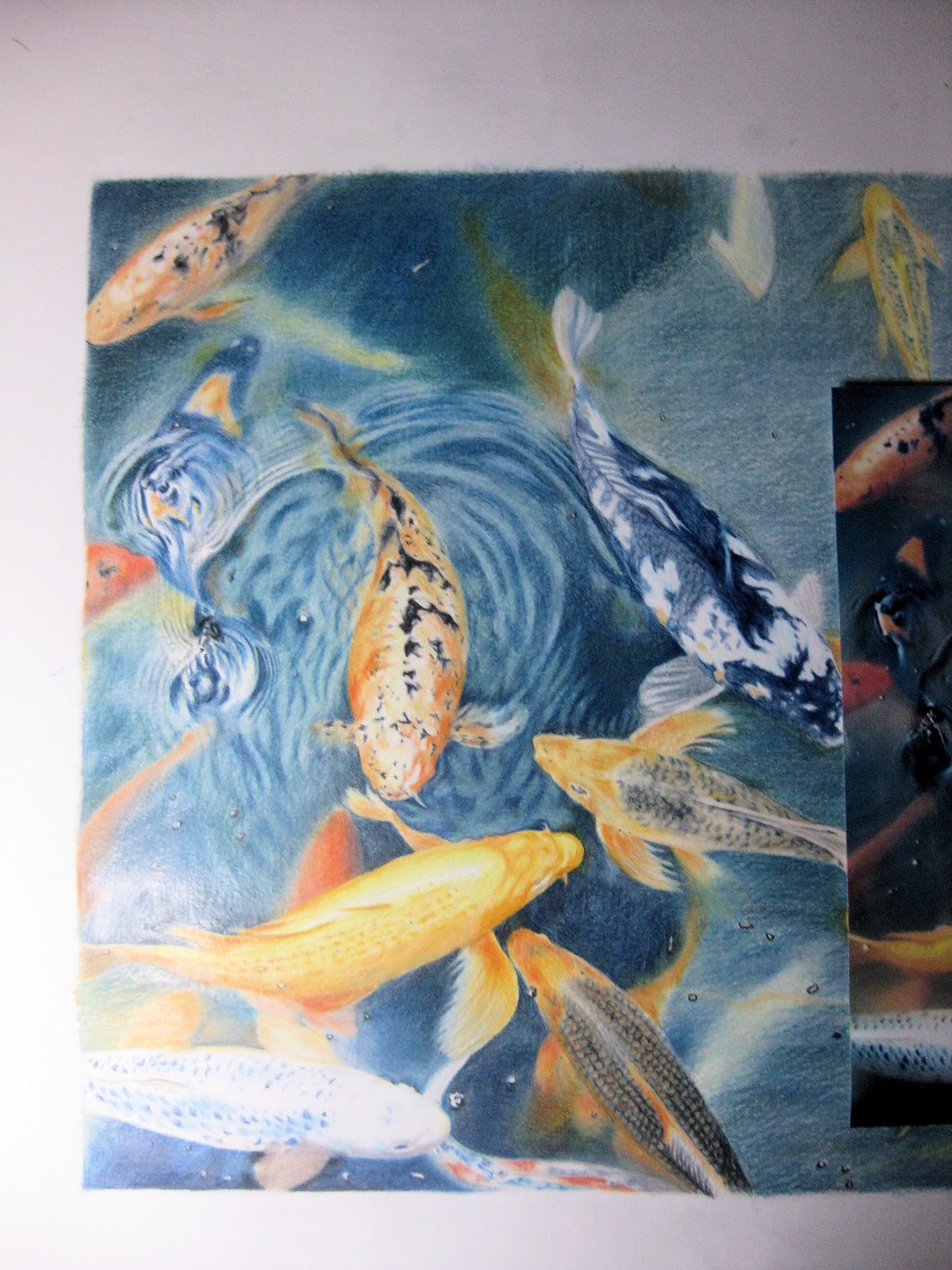
Wow! It's been a long interlude between the last blog and this one. Life seems to get in the way sometimes. Yesterday evening I made the firm decision that today would be the day to finally finish off the drawing. It's been lying there waiting for the last pencil strokes for quite a while now and really it's just a matter of about half an hour and some discipline. The half hour is easy since I'm recovering from a cold and don't feel like doing much else. The discipline is the tough bit, but I'm determined - today is the day. So I retire to my little studio, turn on the heater (spring is sooooo late this year) and the radio, clear my desk of all my jewelry-making paraphernalia, lay out my pencils and the almost complete drawing and get started, at last! Really the only thing that needs doing is to darken a few small areas, deepen some shadows around the fish and highlight a few ripples in the water. Using indigo, prussian blue and ivory black I do just that. What was the problem? It really did only take about 30 minutes and I'm fairly satisfied with the result.

Just two small things left to do... take the eraser and clean up around the by now fairly grubby margin and, finally, add my signature and the date in my customary manner in the lower lefthand corner...

There might be 22 colours in the woods, but there are 25 (and maybe even a few more... I may have lost count along the way!) in the Koi pond.

And this is it....after a total of 40 hours and 5 minutes from beginning to end....finished!


Now I have bigger fish to fry... what will I draw next?...

Darker and Deeper

At this point everything is pretty much finished, except I have to make the background much darker, giving the water more depth.

 As you can see in this photo, I'm aiming for something close to the darker shades of the photo I'm working from, visible at the right. Using prussian blue and indigo I apply a few layers to the entire background. You can see how light everything is to the right of the drawing.


There's still lots to be done.... but by applying a slightly darker blue on each layer and then introducing some jade green things start to look right.


It's important to have all the pencil strokes go in the same direction. This whole exercise takes ages - a sitting of 1 hour and 20 minutes, another of 2 hours and 35 minutes. Still not finished but I'm getting there....
Using the Chinese white at a different angle I carefully blend everything together. The stumper is useful here too, helping to get the surface as smooth as possible.

Now it's time to add some Delft blue, remembering to keep leaning on a clean sheet of paper to keep the drawing from being smudged.
This takes another 45 minutes.


 More blending and shading at the next session and 2 hours later this is the result.

40 hours and 5 minutes in total so far. Not bad, but still a bit more to be done.


donderdag 8 november 2012

Water at Last!

It was a lovely bright day with no demands on my time so I took the opportunity to spend the day drawing. Having filled in all the fish during the last sitting it was finally time to tackle the water, starting in the top lefthand corner and leaning on some clean paper to prevent the drawing from getting smudged in the process. Using a blend of spruce green, prussian blue, blue grey, and burnishing with Chinese white I made the water much darker, deepening the ripples and heightening the shine where needed.

Here you can see the already drawn in ripples, but these need deepening, refining and smoothing as does the surrounding water. I'll attempt to eliminate the pencil strokes as much as possible to make the final picture more realistic. This takes a lot of time, lots of layers, plenty of pressure on the pencils, a lot of burnishing and minute attention to detail. We'll see how close I can get to the picture in my head...

The roughly penciled in shapes and details of the water are clearly visible here. These will need to be a lot darker in tone and very much smoother.
In this photo I've done a fair amount of work on the movement in the water by adding lots of colour and smoothing things out with the help of the stumper. An eraser is very useful to help highlight the top "ridges" of the ripples. For very small white areas, particularly along the finer rings it can be helpful to cut tiny pieces of eraser with a paper knife for better accuracy. You can emphasize the light by adding dark colour in between the rings, but always blend and soften the edges so that the lines don't appear to be drawn.

Time for a break! I've had to turn on my daylight lamp so I can continue drawing. That's the trouble in the autumn and winter - the light fades quickly and it's not as easy to see the subtle differences between the various shades of colour. (That might of course be something to do with my gradually deteriorating eyesight, but shushsssss, we're not talking about that! I'm delaying the wearing of glasses for as long as possible! Well, I only need them for everything that's off in the distance. Trouble is, the distance is getting closer!). Anyway, I'm having a break now, looking out my window at the lovely trees. And no, that's not my halo you see reflected in the window, or a UFO hovering over the little park out the back, it's just that very useful magnifying daylight lamp which is allowing me to carry on drawing despite the clouds and fading light.

One cup of tea and a lot more drawing later and I've made some real progress. But more work needs to be done on the lower corner...
... and that's exactly what I do next, not forgetting the blurs of orange deeper in the water.
This photo shows how much darker the water on the left of the drawing has become. It's much darker in the room now so the flash from the camera shows up to the extreme left but you can see a clear difference in the depth of blue around the blue/white fish to the right. I'm working my way across to the right side.
Well, I've been busy now for 6 hours and 20 minutes - a very satisfying day of drawing - bringing the total time spent to 33 hours and 25 minutes so far. I'm guessing it'll be another 8-10 hours before the drawing is properly finished, but we'll see. It's going to be a challenge to get the water looking just as dark as in the photograph - but that's the fun of the exercise!

woensdag 7 november 2012

Fish Coming Along Swimmingly

Yes! The last few fish swim into view - well not quite, they still have to be drawn, but I'm almost there and very eager to finish. I sit down for another 3 and a half hours in my little studio, perfect daylight shining in through the window over my desk, online RTE radio playing in the background, little electric heater blowing heaven sent warm air onto my feet (it's such a cold room, with only a thin brick wall between me and the elements - ok cut the drama! - it's decidedly chilly in there though so the heater is necessary to keep me from retreating to the warmth of the living room). Anyway, I get on with it. All thought ebbs away as I become absorbed in the colours and shapes and I'm a happy bunny.

I add another fish, this time a pale little fellow with pinkish white skin and a deep orange patch on his head and some slight hints of a lighter orange around the nose. Deep tones in the water around the Koi's head serve to outline the details near the mouth. I also fill in more water, not forgetting to add the "floating bits" and shading them more deeply on the lower edges to capture the correct angle of light. I admit, the water doesn't look like much now, but there's a lot more work to be done on the whole of the water before I can call this a finished drawing. Now I just want to get those seemingly endless numbers of fish drawn in - then I can get on!

The water below this fish is filled with the blurry shapes and colours of more fish deeper down in the water. I sketch these in and do some more blending - they'll get more attention later on.
I step back and look at the surface of the water and, subsequently, start to draw in the beginning of some ripples near the sides and tails of these last fish. Again these will get more attention during the final stage when I'm sprucing up the water.
Just one last fish, some more ripples and a little water and the details of the drawing are finally all filled in! The light is starting to fade so it's time to stop for the moment.
It's taken 27 hours and 5 minutes to get this far, but the fish are coming along swimmingly!
Next time I get to bring things to life by tackling the really fun part - the water....

Onwards and Upwards

I'm keeping this entry short, not because I'm bored because that's not the case - I'm actually really enjoying the drawing now and can see how it will all turn out in my mind's eye. Until the final "polishing up" stage the next steps are really only more of the same - blocking in colour and detail on the remaining fish, refining the details as I go and applying the usual sequence of colours to the large areas of water to the right side of the paper.
This time, having already spent a total of 22 hours and 20 minutes on the drawing, I sit down for another 1 hour and 15 minutes  and get on with filling in some more fish and water.

Following the shapes in the photo I colour in some middle chrome orange on one of the remaining fish. Deep chrome accents along the shadow side of the dorsal fin and some gold (which is more of a shade of yellow) along the ridge of the fish's spine are added too, along with the necessary patches of ivory black. Note the deep orange of the upper fin blending gradually into the water, suggesting depth and movement.
I blend all the colours with the stumper - a very useful tool! - and mark in the scales along the sides, taking care not to draw them in too precisely, in the spirit of trying to make the fish appear as natural and "un-drawn" as possible.
Then, having blended everything, I once again highlight the darker patches with ivory black and fill in the water below the fish, burnishing with Chinese white as usual. Orange and yellow is blurred into the water around the head of the fish to imply movement.
Total time now is 23 hours and 35 minutes and there are just a couple more fish to complete... the end is in sight!

A Woolly Interlude

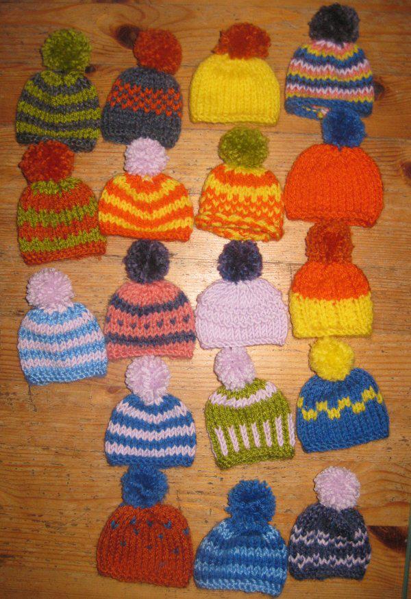
By accident I came across the "Innocent" website (http://www.innocentdrinks.nl/DeGoedgemutsteBreicampagne/) - I think via a link on Facebook, but not sure - and read all about their knitting campagne designed to focus attention on the elderly and to raise money to support the "BoodschappenPlusBus", a project which provides 15,000 elderly people in The Netherlands the opportunity to get out and about.
So, having lots of ends of wool lying about from previous knitting projects of my own, I thought that this was a brilliant way to use them up and began knitting. This photo shows the first 18 mini hats I made. It's turned out to be quite an addictive pursuit - the hats are small and very easy to knit (I've chosen to keep to the most simple pattern, available on the website) and perfect to keep busy while sitting watching TV in the evening. You can be as creative as you like, but keeping it simple means I can get more done. So far I've knitted 53  - all different! The hats have to be sent in (free postage) before the 1st December, so I'll just keep knitting until the time or the wool runs out. What fun!

zondag 21 oktober 2012

Fish in Water and Floating Bits

Eager to get started on filling in a large area of water during this session I decide to draw in a few fish. That might sound contrary (and maybe it is!) but while in most cases the background is filled in before the foreground, I like to do things the other way around. In this case this seems to make more sense to me - after all the fish need to be "in" the water, and by drawing the fish first and the surrounding water later I can blend the fish "down" into the background colour better. Ok, the method is a bit backwards, but it works for me!

I sketch in a small fish using orange chrome, highlighting an area along the fish's back in a deep yellow (gold). I subsequently blend the two colours well into each other and the grain of the paper using the stumper.

I then apply a layer of deep chrome (orange) around the parts of the fish which are lower in the water.
Again the colours are blended together with the aid of the stumper and some Chinese white. Along the lower flank I add some fell grey and gunmetal grey where there is shadow from the larger fish swimming nearby.
Two more fish get the same treatment at the top of the picture and the surrounding water is quickly drawn in with the usual sequence of colours.
I move to a large area of water to the right of these two fish, applying the same layers of colour and making sure to blend them well with the stumper as I work.

It's important to step back from time to time while drawing and look at both the photo you are drawing from and the drawing itself.

 I see that I need to add some "floating bits" so that the water looks more realistic when it's finished. Taking the eraser I erase a few small "dots" here and there on the surface of the water. It's not necessary that these should be totally white, but they do need to be lighter than the water itself. They also need to be emphasised and to have depth, so I take the ivory black and apply shadow along the lower edges. Here it's vital to put the shadow on the same side of each dot so that the fall of light is from the same direction or things will look very odd!

Another couple of fish are (semi-) completed in the same way. I should mention that before applying coloured pencil in any area of the drawing I always make sure the paper is very clean. Using the eraser I erase all non-essential pencil lines, such as the grid lines, and clean the entire area of any smudges - it's amazing how grubby the paper gets while drawing! Equally, I all but erase the sketched in fish (or whatever the subject may be), leaving only just enough pencil to still see what I'm supposed to be drawing. Hey, pay attention!!! Pencil lines will shine through if not removed!

Yet another fish slips into view by the same means. This one is greyer and more dotted, has pale sides and a few darker patches - easy peasy!!!
Then there's another and another.... ooooh, I'm getting the hang of this! That water is way too pale though and there's so much more to do...
I carry on filling in large areas of water, not forgetting the "floating bits". What fun! Scanning the photo once more with a keen and eager eye (ok, I'm getting a bit silly here, but it's late and I'm sleepy) I see some areas of vague colour surrounding a few of the fish, some where a fish has moved at the moment the photo was taken, others where there are fish only barely visible way down deep in the water. I sketch these areas in in pale oranges and yellows and apply the blues and greens of the water on top, blending as I go along.

Putting plenty of pressure on the Chinese white pencil and drawing at an angle to the horizontal lines of the blues and greens I blend everything together, taking care to avoid the "floating bits". The water at the bottom of the picture is created following the same process.
It is now 2 hours and 20 minutes later (22 hours and 20 minutes in all). There's still quite a bit to do but I'm getting there.
Once all the fish are in place the task will be to make the water a lot darker and to eliminate the pencil strokes as far as that is possible (I'm aiming for something like realism here!), and to make those fish  like "fish in water" not "fish out of water"! We shall see...

Spare the Reader, Don't Spoil the Drawing

It's 15.10 on a free afternoon. Time to tackle those fish scales and I mean business! This drawing is taking a long time and I've made innumerable photos documenting every stage. I think though that I'll spare you quite a few of those photos seeing as a lot of the process is pretty much more of the same thing: the same sequence of colours, the same methods of application. At the last sitting I got exceedingly frustrated with a bunch of fish scales. This time I take a deep breath and am determined to stick to the conclusion I arrived at last time, that is, to fill in general areas of colour and not get too bogged down in trying to draw details. I step back and look at the pattern of the fish scales, their angles and shading - a lattice of diamonds, rounded by shade.

I sketch in the basic shapes - that's at least a start.


On closer examination the scales are black, but the orange of the fish is visible at the top of most scales. Using chrome orange I colour in the top of each diamond. But I dislike the result and once again, erase it all! This is looking too "drawn", so I remind myself that I'm supposed to be thinking in areas of colour rather than detail. Ok, another attempt...
I quickly sketch in more rounded scales using black ivory, colour over the entire area with orange chrome and then burnish with Chinese white. This looks worse... for the moment... but I want to establish the look of flesh and of the base of colours which seem to lie underneath the scales, the theory being "more layers, more depth". Let's see if it works...
It seems to make no sense to draw and erase, to shade in and then cover in white, but bear with me, this could be going somewhere!
For the next step, I draw the black edges of the scales back in using ivory black, dotting in the orange at the "top end" of the scales as I go and colouring some orange shading along the left flank of the fish.
I add more black towards the tail where the scales get smaller and darker. Using the stumper I blend some of the colour together to eliminate that "drawn" look and with the eraser lighten up the ridge along the fish's backbone which both shows the fall of light and gives the fish dimension. Ok, this fish has had enough attention for the moment. I'm impatient to get more fish filled in and make more progress with the water.
My attention turns to another fish further up in the drawing. I go to work in the same manner, sketching in shapes and areas of colour. This fish has a lighter, more golden skin underneath the scales and I suggest this using primrose yellow. The darker areas of the head are shaded in with orange chrome.
Ivory black serves for drawing in the scales with a few touches of chrome orange where appropriate. This time I cover the whole area with flesh pink and then once again darken some areas with ivory black and gunmetal grey. I will attend to the fins when I tackle the surrounding water, as this will involve some blending of colours between the two.


It's 2 and a half hours later (20 hours all together) and I think I've managed not to spoil the drawing. Next time I'll carry on in the same way - maybe there is method in my madness afterall!