zondag 21 oktober 2012

Fish in Water and Floating Bits

Eager to get started on filling in a large area of water during this session I decide to draw in a few fish. That might sound contrary (and maybe it is!) but while in most cases the background is filled in before the foreground, I like to do things the other way around. In this case this seems to make more sense to me - after all the fish need to be "in" the water, and by drawing the fish first and the surrounding water later I can blend the fish "down" into the background colour better. Ok, the method is a bit backwards, but it works for me!

I sketch in a small fish using orange chrome, highlighting an area along the fish's back in a deep yellow (gold). I subsequently blend the two colours well into each other and the grain of the paper using the stumper.

I then apply a layer of deep chrome (orange) around the parts of the fish which are lower in the water.
Again the colours are blended together with the aid of the stumper and some Chinese white. Along the lower flank I add some fell grey and gunmetal grey where there is shadow from the larger fish swimming nearby.
Two more fish get the same treatment at the top of the picture and the surrounding water is quickly drawn in with the usual sequence of colours.
I move to a large area of water to the right of these two fish, applying the same layers of colour and making sure to blend them well with the stumper as I work.

It's important to step back from time to time while drawing and look at both the photo you are drawing from and the drawing itself.

 I see that I need to add some "floating bits" so that the water looks more realistic when it's finished. Taking the eraser I erase a few small "dots" here and there on the surface of the water. It's not necessary that these should be totally white, but they do need to be lighter than the water itself. They also need to be emphasised and to have depth, so I take the ivory black and apply shadow along the lower edges. Here it's vital to put the shadow on the same side of each dot so that the fall of light is from the same direction or things will look very odd!

Another couple of fish are (semi-) completed in the same way. I should mention that before applying coloured pencil in any area of the drawing I always make sure the paper is very clean. Using the eraser I erase all non-essential pencil lines, such as the grid lines, and clean the entire area of any smudges - it's amazing how grubby the paper gets while drawing! Equally, I all but erase the sketched in fish (or whatever the subject may be), leaving only just enough pencil to still see what I'm supposed to be drawing. Hey, pay attention!!! Pencil lines will shine through if not removed!

Yet another fish slips into view by the same means. This one is greyer and more dotted, has pale sides and a few darker patches - easy peasy!!!
Then there's another and another.... ooooh, I'm getting the hang of this! That water is way too pale though and there's so much more to do...
I carry on filling in large areas of water, not forgetting the "floating bits". What fun! Scanning the photo once more with a keen and eager eye (ok, I'm getting a bit silly here, but it's late and I'm sleepy) I see some areas of vague colour surrounding a few of the fish, some where a fish has moved at the moment the photo was taken, others where there are fish only barely visible way down deep in the water. I sketch these areas in in pale oranges and yellows and apply the blues and greens of the water on top, blending as I go along.

Putting plenty of pressure on the Chinese white pencil and drawing at an angle to the horizontal lines of the blues and greens I blend everything together, taking care to avoid the "floating bits". The water at the bottom of the picture is created following the same process.
It is now 2 hours and 20 minutes later (22 hours and 20 minutes in all). There's still quite a bit to do but I'm getting there.
Once all the fish are in place the task will be to make the water a lot darker and to eliminate the pencil strokes as far as that is possible (I'm aiming for something like realism here!), and to make those fish  like "fish in water" not "fish out of water"! We shall see...

Spare the Reader, Don't Spoil the Drawing

It's 15.10 on a free afternoon. Time to tackle those fish scales and I mean business! This drawing is taking a long time and I've made innumerable photos documenting every stage. I think though that I'll spare you quite a few of those photos seeing as a lot of the process is pretty much more of the same thing: the same sequence of colours, the same methods of application. At the last sitting I got exceedingly frustrated with a bunch of fish scales. This time I take a deep breath and am determined to stick to the conclusion I arrived at last time, that is, to fill in general areas of colour and not get too bogged down in trying to draw details. I step back and look at the pattern of the fish scales, their angles and shading - a lattice of diamonds, rounded by shade.

I sketch in the basic shapes - that's at least a start.


On closer examination the scales are black, but the orange of the fish is visible at the top of most scales. Using chrome orange I colour in the top of each diamond. But I dislike the result and once again, erase it all! This is looking too "drawn", so I remind myself that I'm supposed to be thinking in areas of colour rather than detail. Ok, another attempt...
I quickly sketch in more rounded scales using black ivory, colour over the entire area with orange chrome and then burnish with Chinese white. This looks worse... for the moment... but I want to establish the look of flesh and of the base of colours which seem to lie underneath the scales, the theory being "more layers, more depth". Let's see if it works...
It seems to make no sense to draw and erase, to shade in and then cover in white, but bear with me, this could be going somewhere!
For the next step, I draw the black edges of the scales back in using ivory black, dotting in the orange at the "top end" of the scales as I go and colouring some orange shading along the left flank of the fish.
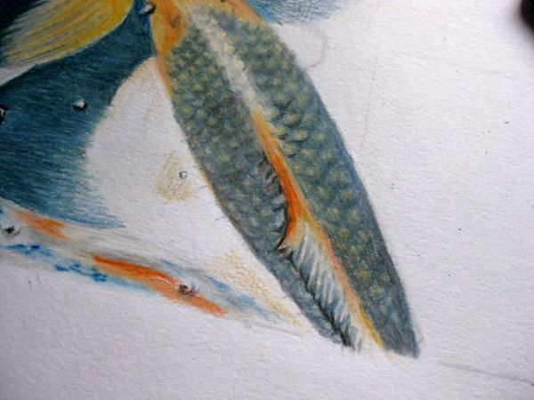
I add more black towards the tail where the scales get smaller and darker. Using the stumper I blend some of the colour together to eliminate that "drawn" look and with the eraser lighten up the ridge along the fish's backbone which both shows the fall of light and gives the fish dimension. Ok, this fish has had enough attention for the moment. I'm impatient to get more fish filled in and make more progress with the water.
My attention turns to another fish further up in the drawing. I go to work in the same manner, sketching in shapes and areas of colour. This fish has a lighter, more golden skin underneath the scales and I suggest this using primrose yellow. The darker areas of the head are shaded in with orange chrome.
Ivory black serves for drawing in the scales with a few touches of chrome orange where appropriate. This time I cover the whole area with flesh pink and then once again darken some areas with ivory black and gunmetal grey. I will attend to the fins when I tackle the surrounding water, as this will involve some blending of colours between the two.


It's 2 and a half hours later (20 hours all together) and I think I've managed not to spoil the drawing. Next time I'll carry on in the same way - maybe there is method in my madness afterall!

vrijdag 5 oktober 2012

Frustrating Fish Scales!

It's been a while since I sat down to draw - life has a habit of getting in the way - and therefore also a while since I wrote anything more in this blog. Anyway, after a too lengthy pause I finally started working further on my Koi fish drawing today. I could have made some real progress were it not for the obtstacle of fish scales and the hazard of over-drawing. With me, over-drawing seems to happen most when I'm out of the habit of drawing at regular intervals and today's fiasco was no exception to the rule.

I started drawing where I had left off the last time. I took a prussian blue pencil and drew in the shape of the scales. "That's good", says you. "WRONG!" says I. That was my first mistake, and being out of my usual drawing routine and impatient to get this fish completed I carried on regardless. The fish began looking lumpy, the scales fake, the shapes all wrong. And still I carried on... "Never give up, just keep going, it'll turn out alright if I just stick at it", I told myself.

"Wrong again!" But was I listening to myself? Of course not. I kept going... and turned a potentially ok fish into an ugly monster with blurry, bumpy scales, all the wrong colour and well, "drawn"! Yes, that's a dirty word. Why? Well, this is supposed to become a realistic drawing, a drawing in which the viewer barely notices the pencil lines and is struck by the natural appearance of the Koi fish swimming around happily in reflective water, disturbed only by their fins. This was going nowhere! No, it was going to hell!

With my usual impatience I turn my attention to the murky, fin-filled waters at the lower flank of the fish, expertly ignoring the mistakes I've made. It'll be fine, you'll see!..
I blend spruce green, juniper green, oriental blue, chrome, and some blue-grey and Chinese white, making sure to leave a few small roundish white areas for the "things" floating in the water. Using ivory black I highlight the lower edges of the white spots so they appear to float on the surface of the water. I add extra deep chrome to the tops of the fins at the closet point to the fish's body. This raises the top of the fins, while the blended area suggests that the fins are further down in the murky water. The orange is mixed with the colours of the water to suggest movement.

I move my attention to another fish a little higher up in the drawing. Using chrome and deep chrome I shade in the shapes on the head of the fish, using ivory black for the eye. Some prussian blue, juniper green and spruce green suffices to create the shadowed area in the water around the head. Time to sketch in the scales, which I'm still finding difficult to get to grips with. The scales have to be fairly regular in distribution, the colour darker in some areas but most importantly they mustn't appear drawn, but natural. Hmmm... I attempt to draw them in but...

...it's just not working. In exasperation I grab the eraser and rub it all out! It's best left to another sitting. Next time, less drawing, more suggesting areas of colour. This has taken 1 hour and 20 minutes (the entire drawing 17 hours and 30 minutes, so far). FRUSTRATING FISH SCALES!!!

vrijdag 10 augustus 2012

Like a Fish out of Water

There's a fish swimming at the top of the picture which has beautiful blue patches and this is the next fish I decide to work on.

I lightly sketch in the shapes of the patches along the fish's back and tail using prussian blue.
Then applying the normal sequence of colors (spruce  green, oriental blue, juniper green, prussian blue, blue grey and chinese white) I fill in another area of water beside the fish, blending everything together in the usual way. The fish has a small patch of orange (middle chrome) near it's tail and again, to suggest movement I mix a little primrose yellow in the water beside the tail, blending well.

I draw in the scales, an irregular "diamond" pattern along the blue patches on the fish's back.
Then using prussian blue and lots of pressure I fill in the darker areas. When drawing, it's vital to pay attention to the shapes you see and the depth of colour, rather than trying to draw the object itself. That might not sound very logical, but any drawing is made up of shapes and colour (or negative space, if you like) and if all these are drawn accurately, an accurate drawing will be the result.
I add a few small pale orange (middle chrome) patches to the white areas of the fish's back, and continue adding more prussian blue to the fish's head.
Once again I draw over the lines of the fish scales...
... and deepen the darker areas along the dorsal fin, the back and the head of the fish. I'm fairly pleased with the result so far, but this fish looks like it's floating on top of the water, something I talked about in the last blog. I can see I'm going to have to give the water a lot more attention - at the moment it's too pale and lacking in depth, but I did know this already. I was keen to get a few fish drawn first and will probably tackle the water again when I next sit down to draw.
This is how it all looks at the moment... and yes, that blue-patched Koi in particular is looking "like a fish out of water"!

It's 1 hour and 45 minutes later (16 hours and 10 minutes in total) and I'm done for the day.

The next stage will be to deepen the colour of the water and put that fish back where it belongs!

1 + 1 = 1 Fish

I really must remember to write these blogs as soon as I'm finished a drawing session, I really must remember to write these blogs as soon as I'm finished a drawing session, I really must... Well, maybe next time I really will! In the meantime, this piece is about the session before last, a 2 hour sitting. Always prefering to begin with something new I decide to work on the pale fish in the lower lefthand corner. Also working from left to right will enable me to work without smudging anything with my hand and arm.

The most noticeable thing about this particular fish is it's beautiful blue markings on very pale whitish skin. Using sky blue I lightly pencil in the scales on the flank of the fish's body and then go over the whole area lightly with the same pencil (using the side of the tip to avoid drawing lines). Again, using the same pencil, but applying more pressure, I go over those scales which I want to stand out. It's important not to draw the scales very precisely in the expected "scale shape" and to draw paler, irregular and lighter and darker scales. The aim is to get as natural an effect as possible.

My attention then shifts to the area of water just above the fish. There's a small orange-coloured Koi in the water below and the suggestion of movement, so I use a middle chrome (orange) pencil, mixed with deep chrome to suggest this and oriental blue and juniper green for the water.
I blend these using the stumper and Chinese white.


Then it's time to fill in some more water, taking care to leave the area for the blue/white fish's fin blank for the moment.
There's a deep orange Koi fish underneath the golden-coloured fish that I've already drawn in, so I pencil in it's tail using deep chrome. and then continue with the surrounding water a small distance. I'll tackle this area again later as it borders on another fish.

And so my attention moves to the bright blue of the water in the lower lefthand corner. I fill this area in using oriental blue and sky blue, leaving some white "spots" where there are "bits"(for want of a better word) floating on the surface of the water.
This close-up shows the  irregular shapes and colour of the fish's scales, as mentioned earlier.
I then start to colour in the fleshy pink/pale orange of the fish's fins, using minimal pressure. The fins are very delicate and I need only suggest the folds with slightly greater pressure on the pencil.
A hint of middle chrome along the upper flank and flesh pink along the lower flank of the fish is also added. Note here too the details of the fish's head. I've suggested the bumpiness of the head with patches of softly applied sky blue. The eye is sky blue and the area around the eye a blend of sky blue and gunmetal grey.
Attention people! Fish need to swim in the water, not float on top of the water - a little prussian blue around the lower fin gives more depth and movement and already the tail end appears lower in the water.
A little more water above the fish's head and I'm nearing the delicate edge of another Koi's fin, so I keep the colour away for the moment...
... until I can draw in the ragged edge of the fin. Then I carefully join up the two areas of blue.


I deepen and blend the colours to achieve more depth. And so we have another fish swimming happily in the water! I've now spent a total of 14 hours and 25 minutes on this drawing and I'm thinking that there are many more hours to go - but I'm starting to enjoy it! This session was 1 hour, followed by the obligatory (short) tea break and then 1 more hour. Which just goes to prove, dear maths teachers,  that 1 + 1 = 1 Fish!

woensdag 1 augustus 2012

Water, Water Everywhere...

Another day, another bash at getting this drawing completed. In keeping with my wandering attention I decide to pay some to a tiny, light-coloured fish at the top of the drawing and (mostly) the surrounding water. Well, it has to be done, and I feel like using the blues and greens. So here goes...

I apply a layer of white (yes, Chinese - yawn!) to the area marked out for the little fish. It has a very light colour, really just whitish with a tinge of blue. I use prussian blue, a thin layer of primrose yellow which I subdue with more white, and then some sky blue and more white and blend them all together. A vague hint of light orange (chrome) suffices for around the nose area of the fish.

But the attention it will wander, so I start working on the surrounding water.

Sticking to the usual sequence of colours I apply a layer of  spruce green, drawing in horizontal strokes and using the side of the pencil tip. Always make sure to keep the tips of the coloured pencils well-sharpened - this gives more surface to draw/shade with and also prevents the paper from getting scratched and dented by the wood of the pencil, as will happen if allowed to become blunt.

Taking the stumper I blend the colour into the paper using downward strokes. (This is a little difficult to see in the photo to the left, but there's, as yet, little pigment on the paper. However, it does help to even everything out).
Again, using horizontal strokes and the side of the pencil I make a layer of oriental blue over the previous layer.
The stumper is once more useful in blending the colours together in the same way. Notice how the whiter areas in the grain of the paper are beginning to fill with pigment.
Now I mix in a little orange chrome near the tail of a large fish to the left. There's just an impression of a fish swimming underneath in the depths of the water and a slight blend of orange will suffice to show this.


Drawing, like life, is one big experiment from which we learn as we go along, so not satisfied with the results after adding layers of colour one-by-one I get impatient and decide to apply the rest of the colours - juniper green, prussian blue and blue grey - on top of each other (all horizontally) without blending in between.


This is much more satisfying! Yes, here comes the Chinese white again - it's a tried and trusted device so why change tactics now?! After sharpening the white pencil once again (there'll be nothing left of it soon) I shade in strokes at an angle to the colour layer.


There's enough pigment now to blend the colours nicely together and achieve a much smoother surface. I will return to this again later to create even more depth.

There's a clear division between the  water surrounding the small fish at the top and the water below, so this area will need lots more blending and more colour.

Time to sharpen the white pencil again. I really will have to invest in a bin! :-)
Using the white I make vertical strokes, dragging the colour from the top down into the paler area below.
Then, to further obscure the line between the two areas I re-apply all the normal sequence of colours to the whole area, blending them together with the stumper and more Chinese white, until the two areas become one homogeneous colour. Yay! We have water!

Time to move on to bigger fish - literally! It's very important to keep your drawing clean as you work. You'd be surprised how quickly a drawing can become grubby just from leaning on it with your arm. A great solution is to work with your hand resting on another clean sheet of paper - this protects the underlying drawing and prevents white areas from becoming smudged.

Of course, not being in the habit of always practicing what I preach (well, I never said I was perfect or had all the answers!) I forgot to do this this time. Oh well, there's always the eraser to resort to - and I do! I clean up inside the lines of a large Koi fish which is the next fish I'm going to draw. Don't be tempted to leave the cleaning and add colour on grubby paper - it will show through and you will be sorry!

With prussian blue I sketch in the outlines of the patches on the fish's back. Using light grey I add the shaded detail on the side fins. Things are moving along!
It's 1 hour and 15 minutes later (12 hours and 25 minutes in total) and this is the drawing so far - "water, water everywhere, nor any drop to drink"... definitely time for a nice cup of tea!