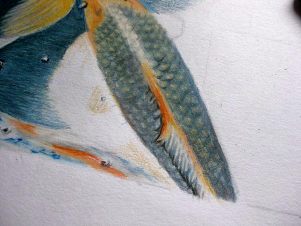
It's been a while since I sat down to draw - life has a habit of getting in the way - and therefore also a while since I wrote anything more in this blog. Anyway, after a too lengthy pause I finally started working further on my Koi fish drawing today. I could have made some real progress were it not for the obtstacle of fish scales and the hazard of over-drawing. With me, over-drawing seems to happen most when I'm out of the habit of drawing at regular intervals and today's fiasco was no exception to the rule.

I started drawing where I had left off the last time. I took a prussian blue pencil and drew in the shape of the scales. "That's good", says you. "WRONG!" says I. That was my first mistake, and being out of my usual drawing routine and impatient to get this fish completed I carried on regardless. The fish began looking lumpy, the scales fake, the shapes all wrong. And still I carried on... "Never give up, just keep going, it'll turn out alright if I just stick at it", I told myself.

"Wrong again!" But was I listening to myself? Of course not. I kept going... and turned a potentially ok fish into an ugly monster with blurry, bumpy scales, all the wrong colour and well, "drawn"! Yes, that's a dirty word. Why? Well, this is supposed to become a realistic drawing, a drawing in which the viewer barely notices the pencil lines and is struck by the natural appearance of the Koi fish swimming around happily in reflective water, disturbed only by their fins. This was going nowhere! No, it was going to hell!
With my usual impatience I turn my attention to the murky, fin-filled waters at the lower flank of the fish, expertly ignoring the mistakes I've made. It'll be fine, you'll see!..
I blend spruce green, juniper green, oriental blue, chrome, and some blue-grey and Chinese white, making sure to leave a few small roundish white areas for the "things" floating in the water. Using ivory black I highlight the lower edges of the white spots so they appear to float on the surface of the water. I add extra deep chrome to the tops of the fins at the closet point to the fish's body. This raises the top of the fins, while the blended area suggests that the fins are further down in the murky water. The orange is mixed with the colours of the water to suggest movement.

I move my attention to another fish a little higher up in the drawing. Using chrome and deep chrome I shade in the shapes on the head of the fish, using ivory black for the eye. Some prussian blue, juniper green and spruce green suffices to create the shadowed area in the water around the head. Time to sketch in the scales, which I'm still finding difficult to get to grips with. The scales have to be fairly regular in distribution, the colour darker in some areas but most importantly they mustn't appear drawn, but natural. Hmmm... I attempt to draw them in but...
...it's just not working. In exasperation I grab the eraser and rub it all out! It's best left to another sitting. Next time, less drawing, more suggesting areas of colour. This has taken 1 hour and 20 minutes (the entire drawing 17 hours and 30 minutes, so far). FRUSTRATING FISH SCALES!!!


Geen opmerkingen:
Een reactie posten