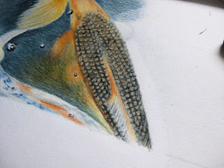
It's 15.10 on a free afternoon. Time to tackle those fish scales and I mean business! This drawing is taking a long time and I've made innumerable photos documenting every stage. I think though that I'll spare you quite a few of those photos seeing as a lot of the process is pretty much more of the same thing: the same sequence of colours, the same methods of application. At the last sitting I got exceedingly frustrated with a bunch of fish scales. This time I take a deep breath and am determined to stick to the conclusion I arrived at last time, that is, to fill in general areas of colour and not get too bogged down in trying to draw details. I step back and look at the pattern of the fish scales, their angles and shading - a lattice of diamonds, rounded by shade.
I sketch in the basic shapes - that's at least a start.
On closer examination the scales are black, but the orange of the fish is visible at the top of most scales. Using chrome orange I colour in the top of each diamond. But I dislike the result and once again, erase it all! This is looking too "drawn", so I remind myself that I'm supposed to be thinking in areas of colour rather than detail. Ok, another attempt...
I quickly sketch in more rounded scales using black ivory, colour over the entire area with orange chrome and then burnish with Chinese white. This looks worse... for the moment... but I want to establish the look of flesh and of the base of colours which seem to lie underneath the scales, the theory being "more layers, more depth". Let's see if it works...
It seems to make no sense to draw and erase, to shade in and then cover in white, but bear with me, this could be going somewhere!
For the next step, I draw the black edges of the scales back in using ivory black, dotting in the orange at the "top end" of the scales as I go and colouring some orange shading along the left flank of the fish.
I add more black towards the tail where the scales get smaller and darker. Using the stumper I blend some of the colour together to eliminate that "drawn" look and with the eraser lighten up the ridge along the fish's backbone which both shows the fall of light and gives the fish dimension. Ok, this fish has had enough attention for the moment. I'm impatient to get more fish filled in and make more progress with the water.
My attention turns to another fish further up in the drawing. I go to work in the same manner, sketching in shapes and areas of colour. This fish has a lighter, more golden skin underneath the scales and I suggest this using primrose yellow. The darker areas of the head are shaded in with orange chrome.
Ivory black serves for drawing in the scales with a few touches of chrome orange where appropriate. This time I cover the whole area with flesh pink and then once again darken some areas with ivory black and gunmetal grey. I will attend to the fins when I tackle the surrounding water, as this will involve some blending of colours between the two.
It's 2 and a half hours later (20 hours all together) and I think I've managed not to spoil the drawing. Next time I'll carry on in the same way - maybe there is method in my madness afterall!


Geen opmerkingen:
Een reactie posten